Project overview
As the Fundrise platform grew, users increasingly struggled to locate and manage certain preferences and settings, which created friction in their overall experience.
I set out to streamline the settings experience with a focus on improving findability and user satisfaction. The goal was to simplify the navigation, organize the options more intuitively, and make it easier for users to quickly locate and modify their preferences. The result was a redesigned settings interface that provided a more intuitive, user-friendly experience.
Role
Product Designer
Company
Fundrise
Platform
iOS, Android, Web
Problem context
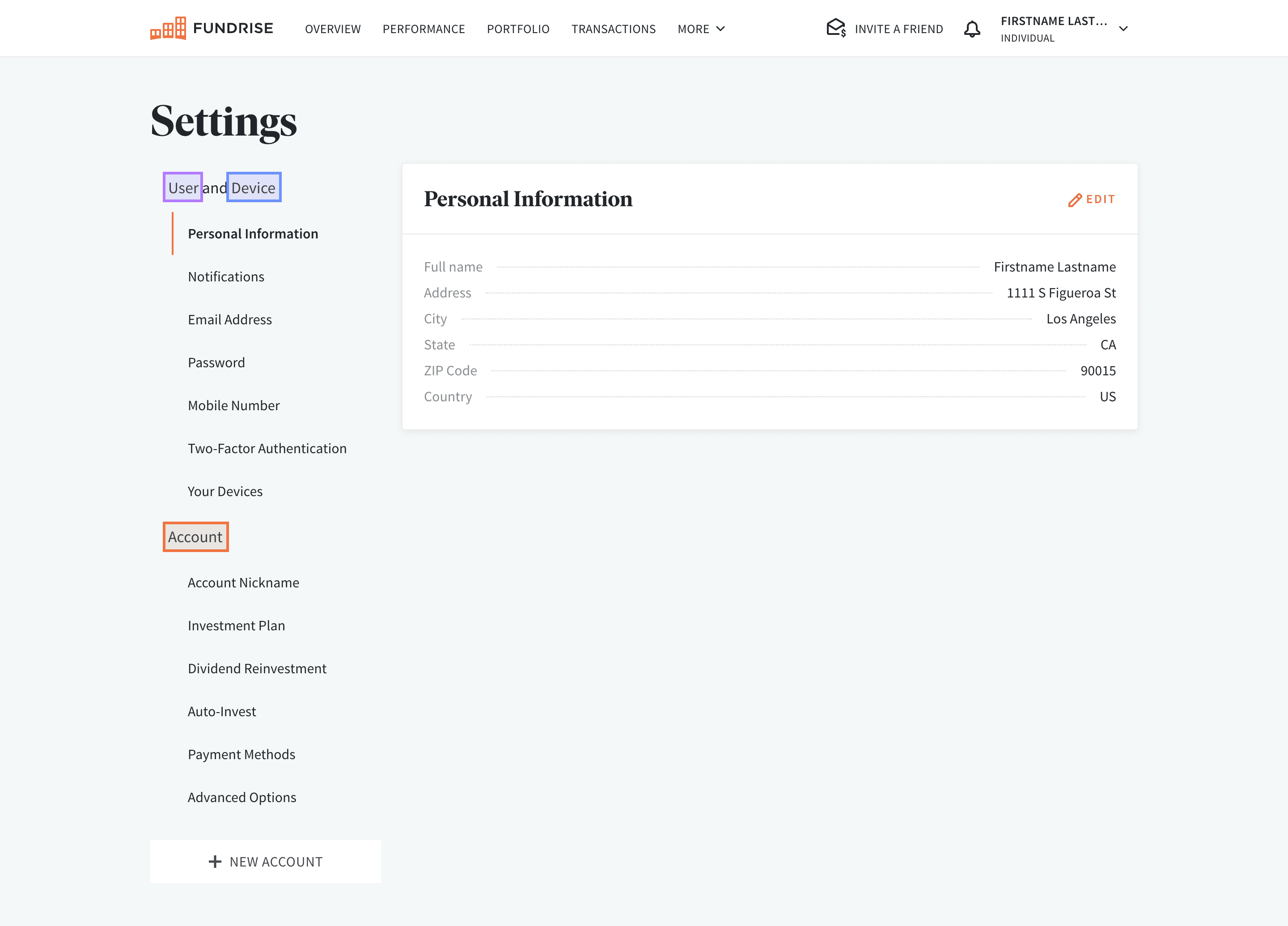
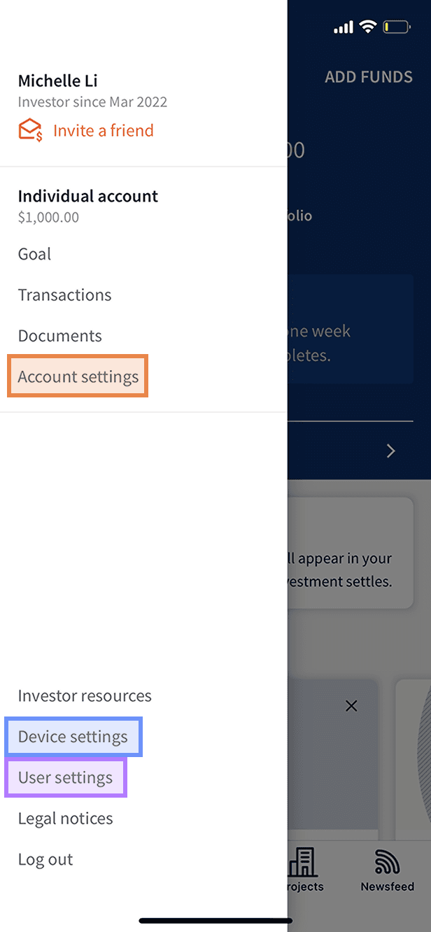
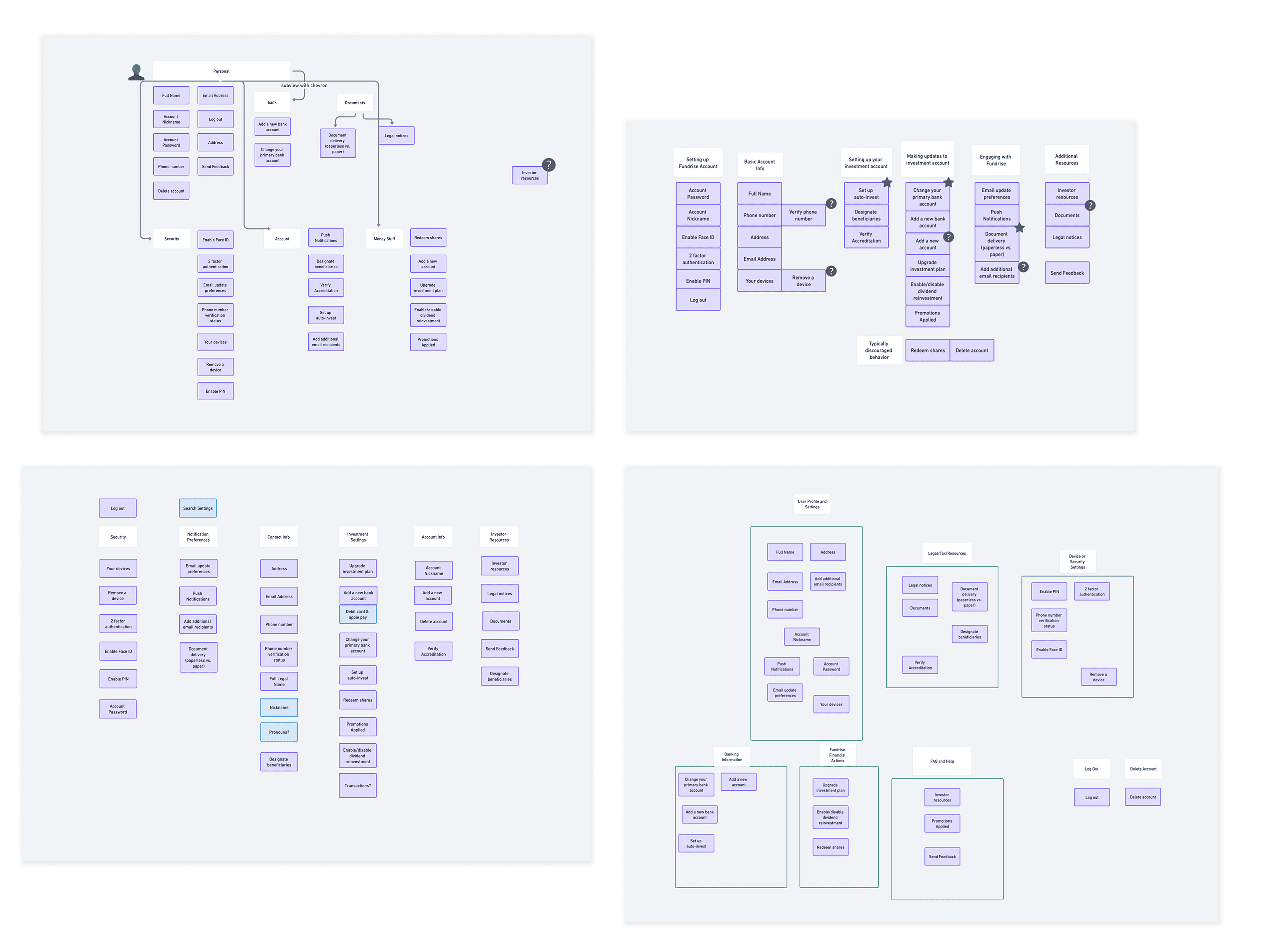
Three types of settings: User, Device, and Account
User and device settings sit at the user level and account settings are specific to each new account the user opens. While a majority of Fundrise accounts only have one account type, accounts can have up to five different account types.
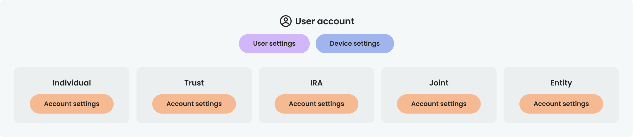
On web, all settings are displayed on a single page, with user and device settings combined, and on mobile, the three types of settings are separated.
Web
Mobile
Why did we need a redesign?
Inconsistencies caused by a lack of a design system: Setting pages have been built and iterated upon over the years without a set of guidelines.
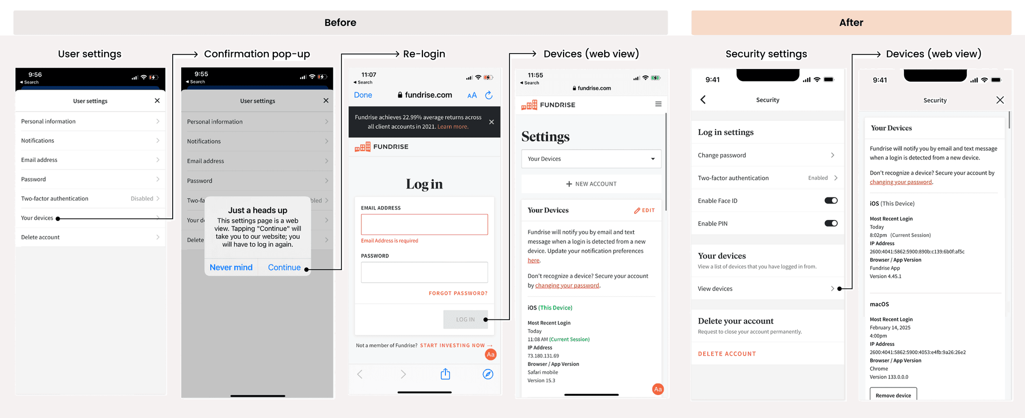
Web-view setting pages create added friction: Mobile users are directed to web-views for pages that don't exist natively. To access these pages, users must re-login.
Scattered mobile settings: On mobile, settings are spread across three different pages making it difficult for users to know where to go to find a specific setting.
Confusing web layout for users with multiple accounts: On web, all settings sit on the same page, which doesn't clearly illustrate the relationship between your main account and the investment accounts under it.
User stories
As a new investor concerned about account security, I want to quickly locate and enable two-factor authentication so that I can protect my investments.
As an existing investor looking to adjust my investment strategy for my retirement account, I want to easily find and update my investment plan so that I can better align it with my financial goals.
Card-sorting
I conducted a moderated, open card-sorting study to compile mental models of the information architecture. Participants were given pre-defined settings and asked to organize them in a way that felt most intuitive to them.
Card sorting patterns
6/8 participants created a grouping related to security with settings like 2-factor authentication, enabling Face ID / PIN, removing a device, and updating your password underneath.
7/8 participants created a grouping related to payments with settings like changing your primary bank account and adding new bank accounts underneath.
7/8 participants created a grouping related to profile/account info with settings like your name, email, phone number, and address underneath.
Previous settings structure
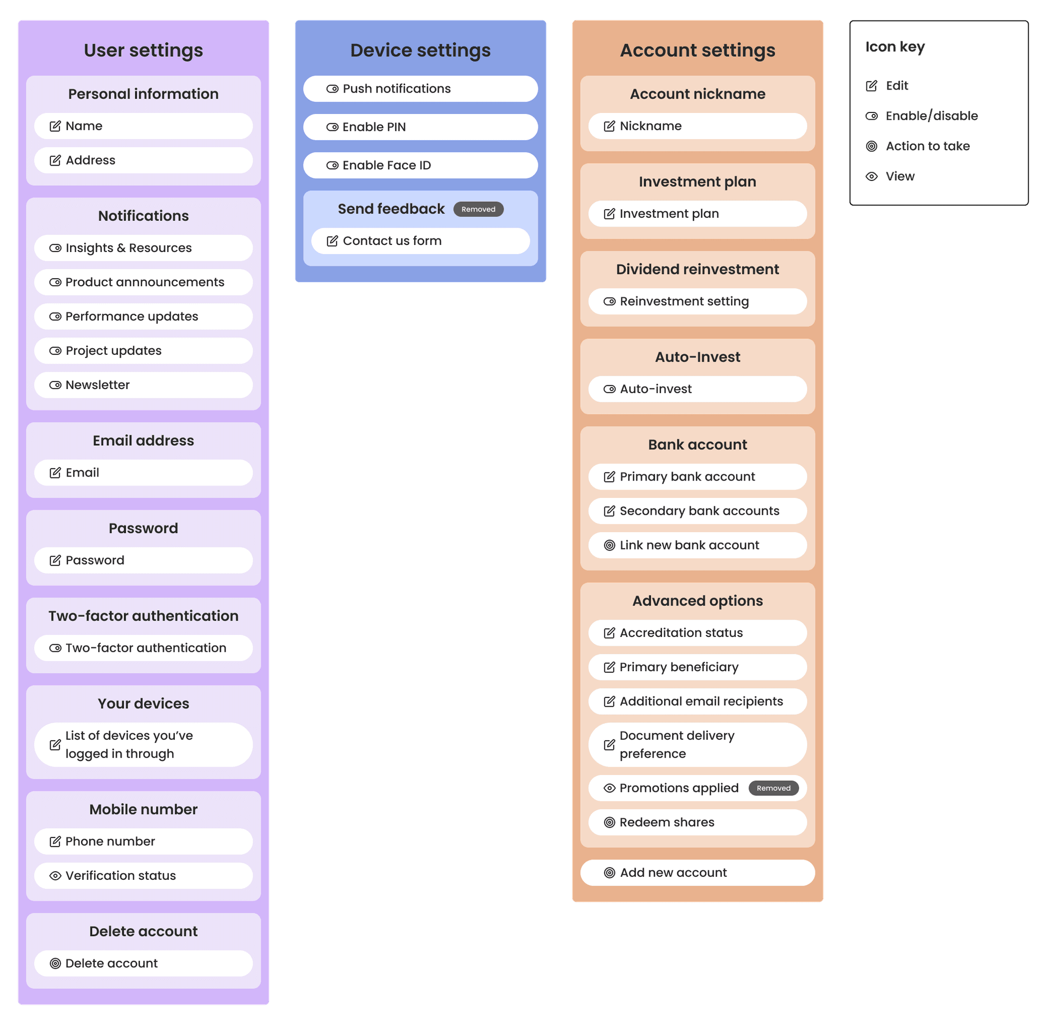
Updated settings structure
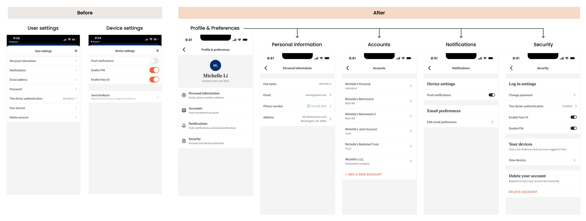
The updated information architecture combines user and device settings into "profile" settings.
"Accounts" was added under profile settings to provide investors with a full list of their individual accounts and communicate that their individual investing accounts sit under their overarching Fundrise account.
"Security" was added under profile settings to group together security and privacy related settings.
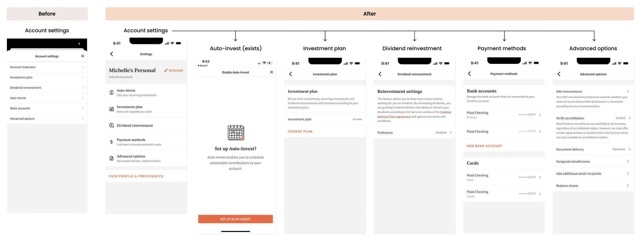
"Bank accounts" was updated to "Payment methods" to support the upcoming addition of debit cards as an investing option.
Wireframes
Should we combine all account settings?
Separate account settings
SELECTED
More feasible to implement and fewer clicks are needed to get to editing an account setting.
Combine all account settings
Allows you to edit an account setting for multiple accounts at the same time.
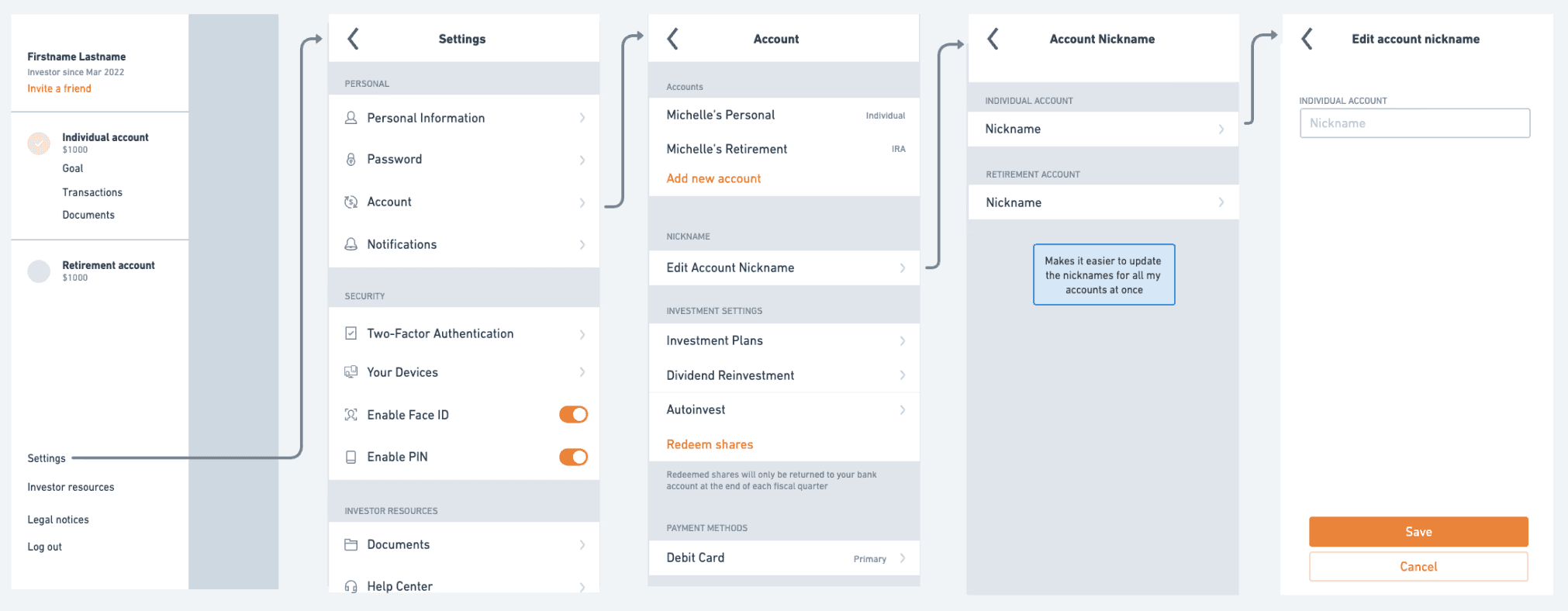
Ultimately, technical constraints and the risk of burying account settings outweighed the benefit of allowing users to view and edit all their account settings in one place.
Final decision: Separate account settings, have them sit under their respective accounts
Which layout makes navigating settings easier?
Drill down by larger categories
SELECTED
Easy to scan and preview all high level setting categories
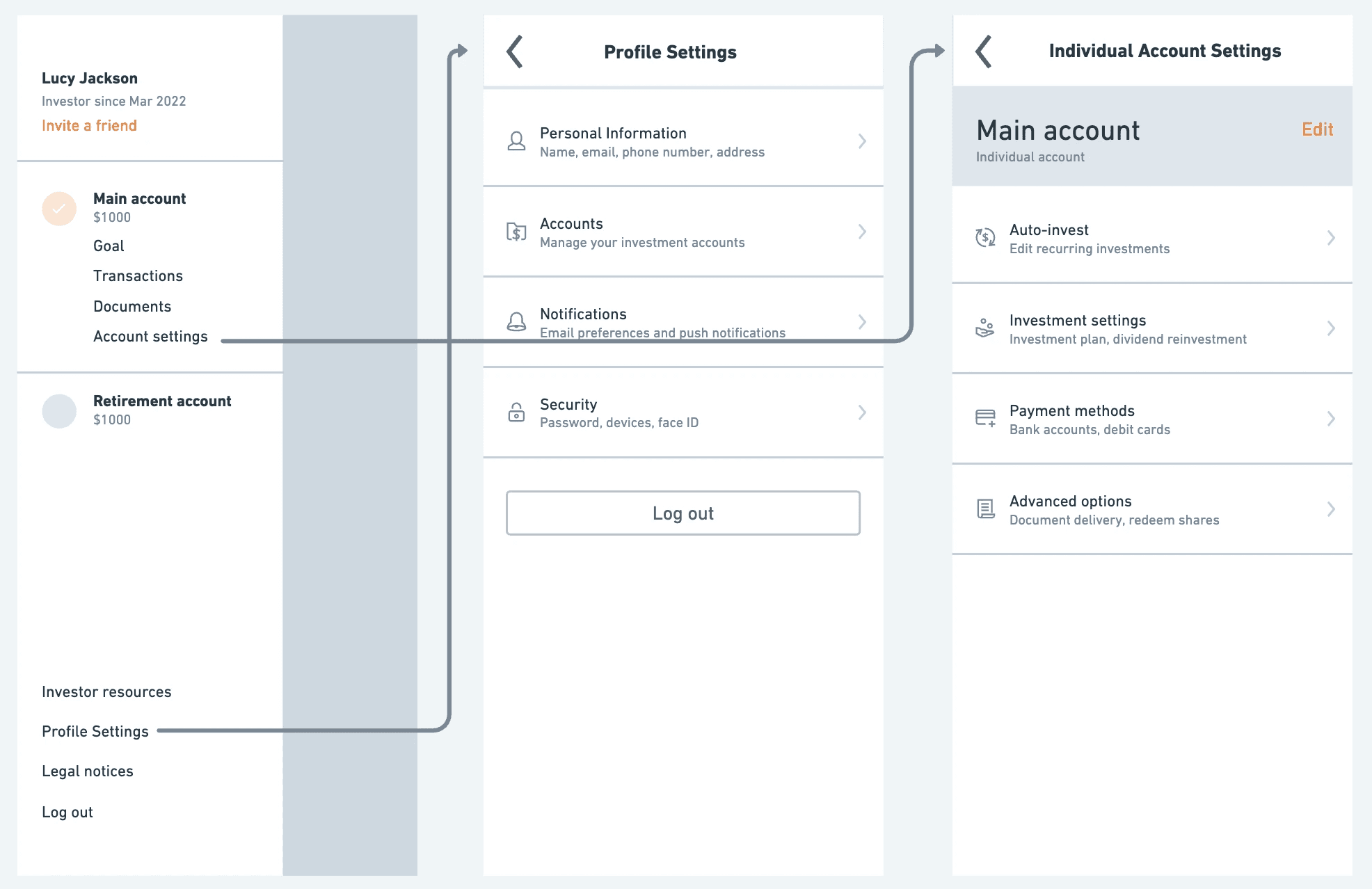
Surface all individual settings
View all settings at once and fewer clicks are needed to get to editing some settings
Ultimately, surfacing high-level categories felt more easy to digest while still allowing us to highlight popular settings, such as auto-invest, by featuring them at the first level. If we were to add new settings in the future, we could do so without overwhelming the layout.
Final decision: Surface high level categories and have users drill down into them
The Redesign
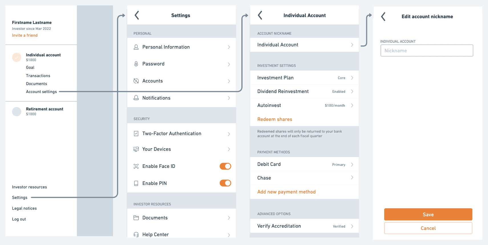
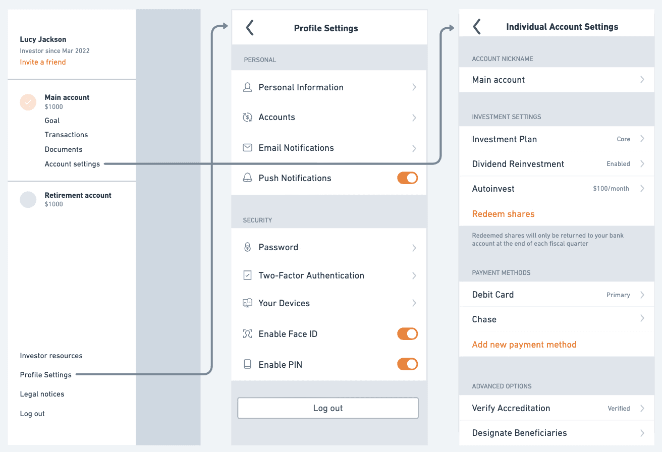
Two settings entry points
Settings is now consolidated to two entry points for both single and multi-account users.
Profile & Preferences: Houses all high level profile information and preferences.
Settings: Houses all investment account related settings and will look different based on what investment account you have selected.
Mobile updates
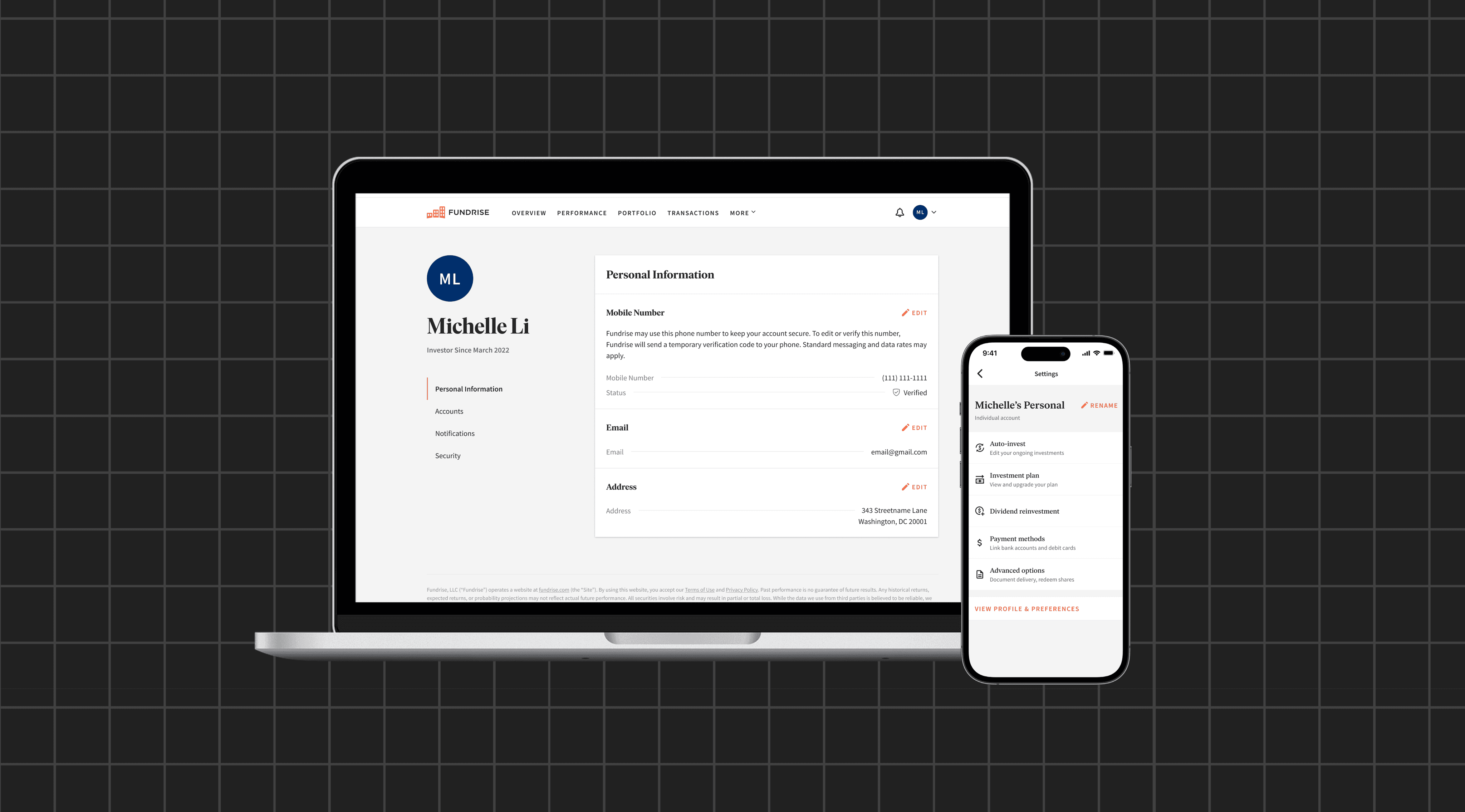
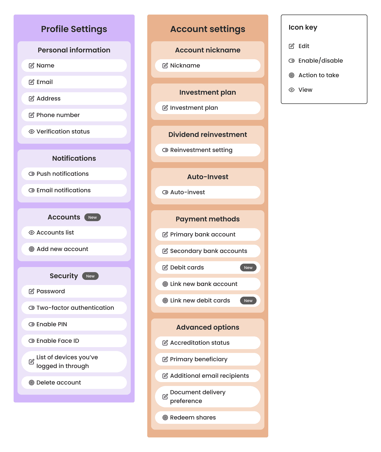
New profile & preferences setting page
User and device settings were merged into a "Profile & Preferences" page. This new layout presents four high-level categories instead of specific settings. From this overview, users can drill down into more detailed and organized settings pages.
Updated account settings page
Account settings follows the same pattern as profile & preferences settings. While the five high level categories are similar to the ones that existed previously, the new organization structure helps users better understand the specific settings within each category.
Automatically authenticated web-views
One pain point in the current experience is the lack of native mobile settings pages. Mobile users are directed to web-views for pages that don't exist natively. One of the major engineering efforts for this redesign was to automatically authenticate users who entered the web through the mobile app. This allowed us to rely on several less important, non-native setting pages for the time being without it being a frustrating user experience.
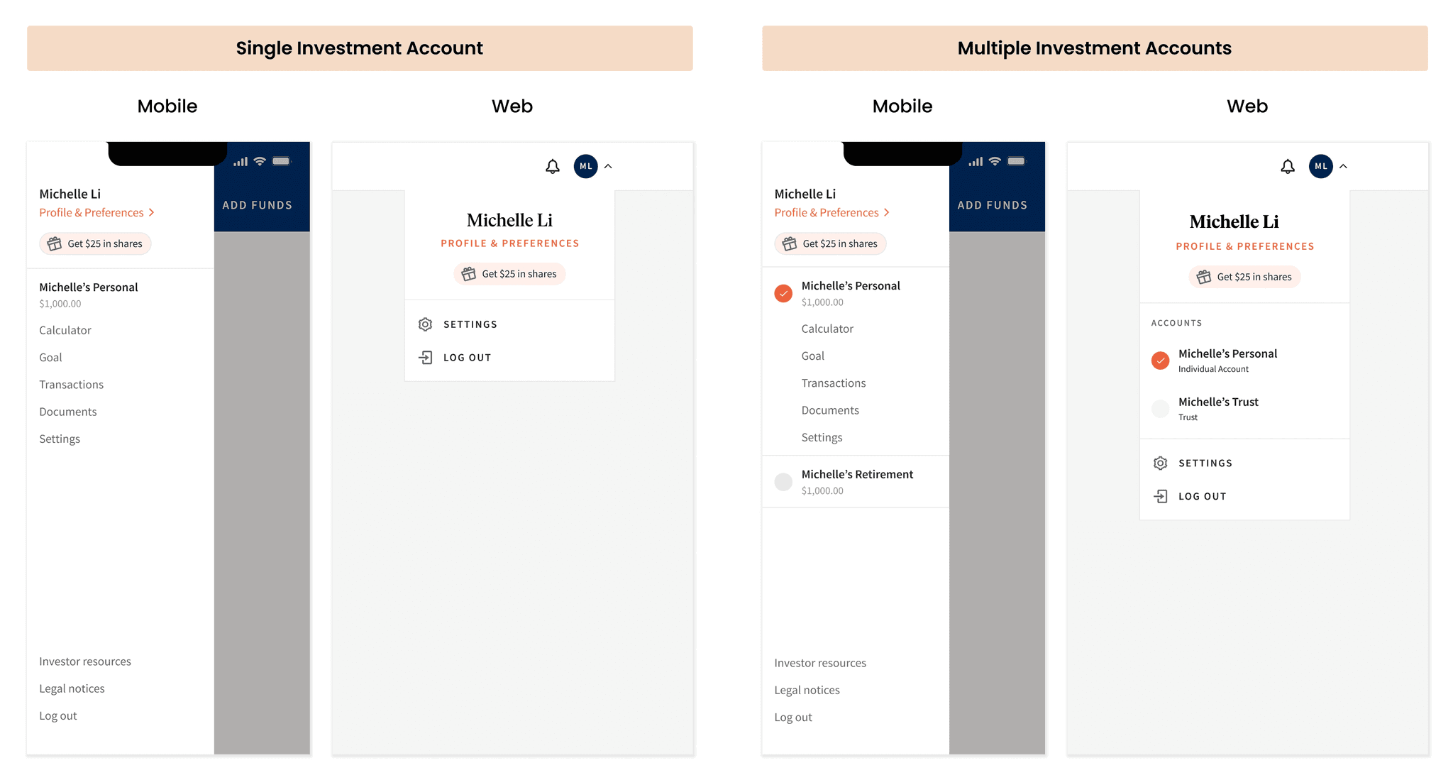
Web updates
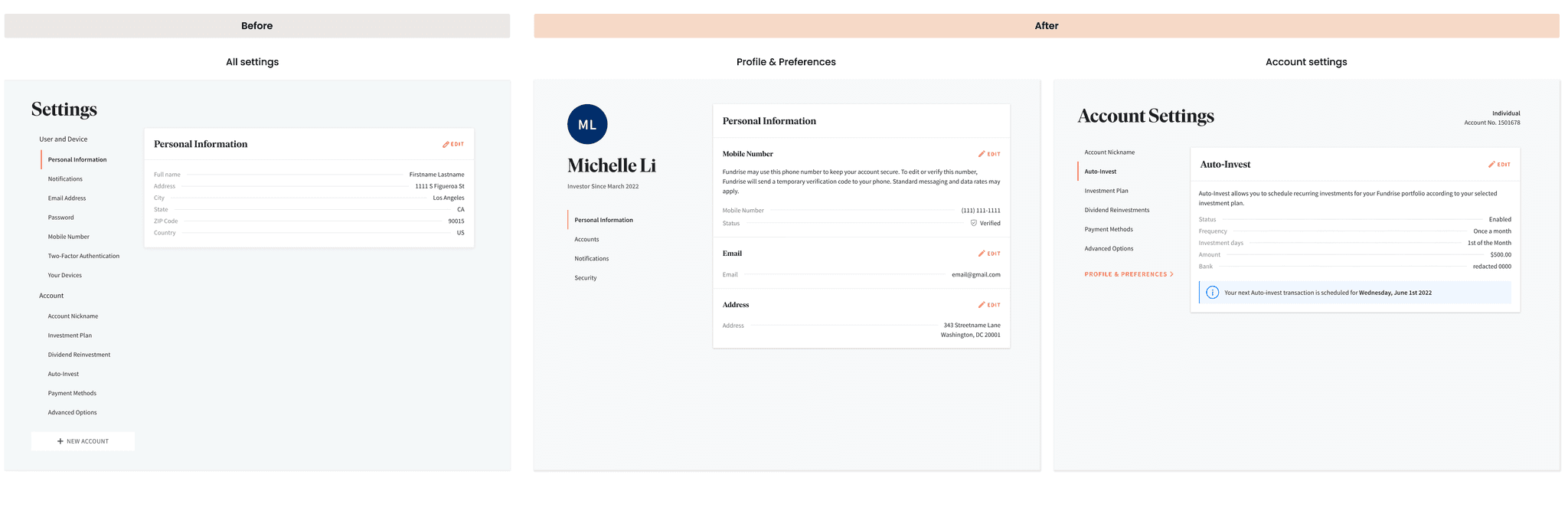
Two distinct settings pages with updated categories
On web, we broke up the single settings page into a Profile & Preferences page and an Account settings page that were consistent with their respective mobile pages. The settings within each page were reorganized into the newly defined categories. Aside from this larger structural change and a few small house cleaning updates, we maintained a large portion of the current web experience.
Outcome & Learnings
Outcomes
Consistency across platforms: The consistent structure on web and mobile will make it easier for new settings to be added in the future
Reduced time / clicks needed to reach certain settings: With web-view authentication, users are now able to immediately view certain settings without having to re-login
Increased views: We saw increased views to settings pages across the board
+142% views for dividend reinvestment setting
+102% views for editing investment plan setting
Project learnings
Involving other team members early on in the process | During the card sorting I brought in an assortment of team members across engineering, design, delivery, and product. This was extremely helpful in gathering a variety of insights and constraints that would inform my design process.
Work smarter, not harder | Instead of building out 15+ net-new native mobile pages, I collaborated with engineering to enable web-views authentication within our mobile experience. This not only reduced the scope of this project, but improved the experience in other parts of the platform where web-views were being leveraged.